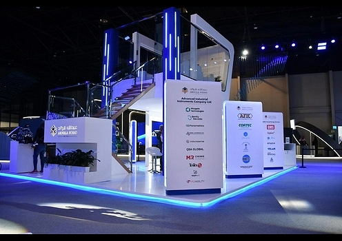
When it comes to creating effective exhibition stands, design is more than just about aesthetics; it's about the brand's message and engaging your audience, which can create a memorable experience. One of the major tools for an effective exhibition stand is color. Color is not only visually appealing but also has a psychological impact on human behavior and emotions. In this blog, we will explore the power of psychology, how color plays a crucial role in booth design, and how it can make your exhibition booth design stand out effectively.
What is Color Psychology?
Color psychology is the connection between human emotions, behaviors, and perceptions. The concept is based on the idea that different colors can evoke specific feelings and influence decision-making. In marketing and design, color psychology is used to target audiences and create an emotional connection with them. When color is used strategically, it can enhance the impact of your exhibition booth design and make a positive and lasting impression.
The Importance of Color in Exhibition Booth Design
In the context of booth design, color can be used to:
Attract Attention : Bright and bold colors in your exhibition booth design can grab attention and help your exhibition design booth stand out among competitors.
Convey Your Brand Identity : Colors can reflect the personality of the brand, and they can communicate its values and mission.
Influence Mood and Behavior : The right color in your exhibition booth design can influence the mood of your visitors and make them relaxed or energized.
Encourage Interaction : Some colors can invite visitors to the exhibition stand, bringing product testing, demonstrations, and simple conversations with your staff.
How Colors Influence Emotions and Behavior
Before getting into the colors for your exhibition booth design, it's important to understand the general psychological effects of colors. Each color says a unique set of emotions and can influence how people recognize your exhibition stand.
Here's a breakdown of some common colors and their meanings :
1. Red
Emotion/Behavior: It shows energy, passion, and urgency.
Usage in Booth Design: Red color is a bold and attention-grabbing color that evokes a sense of urgency and excitement. Use red to highlight the key products or to create a high-energy atmosphere.
Ideal For: In branding food, entertainment, and sports industries.
2. Blue
Emotion/Behavior: It shows trust, calm, and professionalism with security.
Usage in Booth Design: Blue is connected with stability and trustworthiness. It's a great color for businesses, and they convey professionalism, such as financial institutions and technology companies.
Ideal For: Brands in finance, technology, and healthcare.
3. Yellow
Emotion/Behavior: It creates optimism and happiness in the exhibition stands.
Usage in Booth Design: Yellow is cheerful and attention-grabbing, which lifts the mood of your visitors. It draws attention and gives importance to the products while designing. However, yellow gives a heartwarming feeling.
Ideal For: Children's products, creative industries, and brands looking to convey joy.
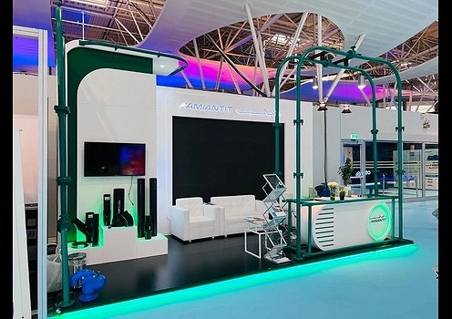
4. Green
Emotion/Behavior: Green is used in growth, health, and nature.
Usage in Booth Design: The green color is associated with nature and health. It's calming and promotes nature. Green is ideal for businesses focusing on sustainability and health. It is used in organic products.
Ideal For: Health and wellness brands, environmental organizations.
5. Orange
Emotion/Behavior: Orange gives energy, enthusiasm, friendliness, and creativity.
Usage in Booth Design: Orange is an energetic and vibrant color. It shows an inviting atmosphere and works well for brands that promote creativity and fun.
Ideal For: entertainment brands, technology startups, and companies looking to convey energy and innovation.
6. Purple
Emotion/Behavior: Purple shows luxury, creativity, and wisdom.
Usage in Booth Design: Purple is associated with luxury and creativity. It gives elegance and prestige to the exhibition booth design, making it ideal.
Ideal For: Beauty products and luxury goods.
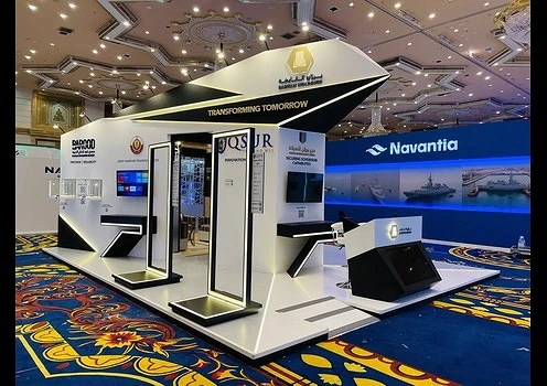
7. Black
Emotion/Behavior: Black shows sophistication, elegance, and authority.
Usage in Booth Design: Black is a powerful color that can convey authority and sophistication. It is used in modern designs and can add a touch of luxury to your exhibition design booth. Black is balanced with other colors to avoid making the space feel too dark.
Ideal For: Fashion industry, luxury brands, and high-end services.
8. White
Emotion/Behavior: White shows cleanliness and purity.
Usage in Booth Design: White is a versatile color that shows simplicity and cleanliness. It creates minimalistic designs that allow other colors to shine on the exhibition stand. White is effective and exhibition stand builders make your exhibition design booth feel open and spacious.
Ideal For: Brands focused on innovation and modern design or those that convey a sense of purity.
9. Pink
Emotion/Behavior: Pink shows femininity, warmth, and romance.
Usage in Booth Design: This color is connected with femininity, but conveys warmth and connection. It can target female consumers, especially in beauty and fashion.
Ideal For: Fashion, beauty and lifestyle.
10. Brown
Emotion/Behavior: Brown shows stability, reliability, and comfort.
Usage in Booth Design: Brown is an earthy color that conveys stability. It creates a sense of warm style. It works with exhibition booth designs focused on organic products and sustainability.
Ideal For: Eco-friendly, organic, and companies focused on comfort.
Creating a Cohesive Color Palette for Your Booth Design
After understanding the emotional and psychological impact of colors, the next step is to generate a color palette for your exhibition booth design by the best exhibition stand builders.
Here are some tips for selecting the right and apt color for your exhibition design booth.
1. Use the 60-30-10 Rule :
This rule is a famous design principle that suggests using three colors in exhibition booth design: 60% should be the dominant color, 30% should be a secondary color, and 10% should be an accent color. This balance ensures a cohesive look without overwhelming the senses.
2. Complementary Colors :
Complementary colors are the colors that are used in the opposite of each other on the color wheel. Orange and blue or green and red are some examples. These colors can create high contrast and can be used for attention in specific areas of your exhibition design booth.
3. Analogous Colors :
Analogous colors are those colors that sit next to each other in the color wheel, such as blue-green and green. These colors can create a calm and interesting look, making them ideal for brands that want to convey a sense of calm and balance.
4. Brand Colors :
Brand colors are those colors that are incorporated in the exhibition booth design to maintain consistency and reinforce the brand recognition. Make sure these colors ensure they evoke the right emotions.
5. Consider Your Audience :
The colors that you choose should connect with your target audience. Such as, if you're targeting an exhibition focused on technology, you may want to choose modern and sleek colors for the exhibition stand, like black, white, and metallics. If your target audience is primarily children and families, bright and playful colors like yellow and orange can be used in the appropriate way for your exhibition booth design.
Practical Applications of Color Psychology in Booth Design
Now, let's explore some practical applications of color psychology in exhibition booth design.
1. Lighting :
The right lighting can enhance the real effects of color and create the desired atmosphere in your exhibition design booth. For example, warm lighting can enhance orange and yellow colors, creating an inviting and energetic environment. On the other hand, cooler lighting can make blues and greens more vibrant and calming.
2. Graphics and Signage :
Choose colors strategically in your graphical representations and signages to highlight your exhibition design booth's key messages or offers. Such as using bold colors like red or yellow for call-to-action messages, while softer colors can be used for background elements to avoid the overwhelming.
3. Furniture and Display Stands :
Use furniture and exhibition display stands that complement your color scheme. For example, if your design incorporates a lot of bright colors, neutral-colored furniture can provide a balance.
4. Branding and Logo Placement :
Ensure the brand's logo is displayed in a color that contrasts with the background, making it easier for visitors to recognize. The color corporation done by the exhibition stand design company should be consistent and specific.
Conclusion
Color psychology is a powerful tool in exhibition booth design that can significantly influence the visitors with your branding and can influence the interaction with your exhibition stand. By incorporating the emotional and psychological impact of colors, you can create an exhibition design booth that not only attracts attention but also resonates with the target audience. The right color palette can help you to achieve your goals and make a lasting impression. So, start designing your exhibition stand with the best exhibition stand contractors, and remember the power of color to elevate your brand and engage your audience.